Lodestar’s brand-new brand


Authored by Cindy Chau
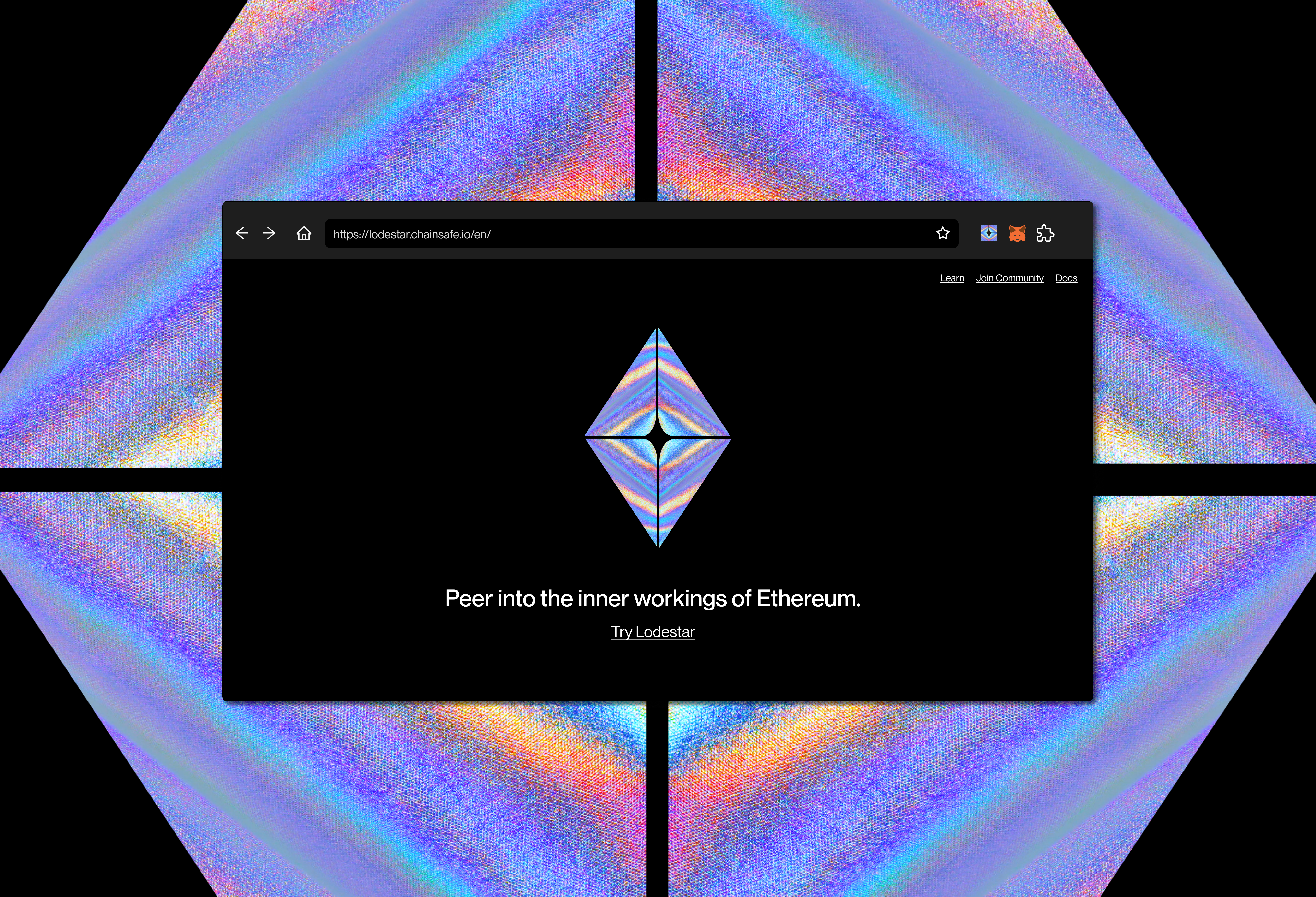
Lodestar's brand-new brand
As the team is hard at work preparing the first light-client prototype and stabilizing the current Eth2 node implementation, we've also made changes to evolve Lodestar's brand identity.
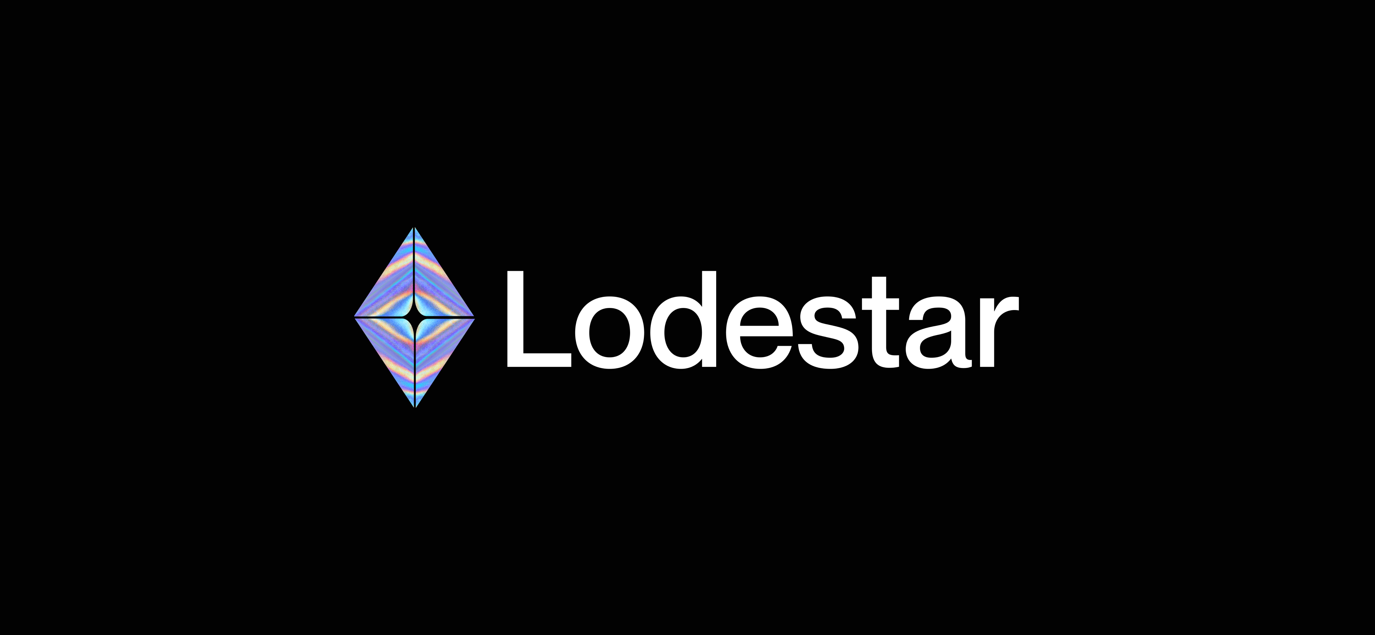
Today we're unveiling an updated logo:
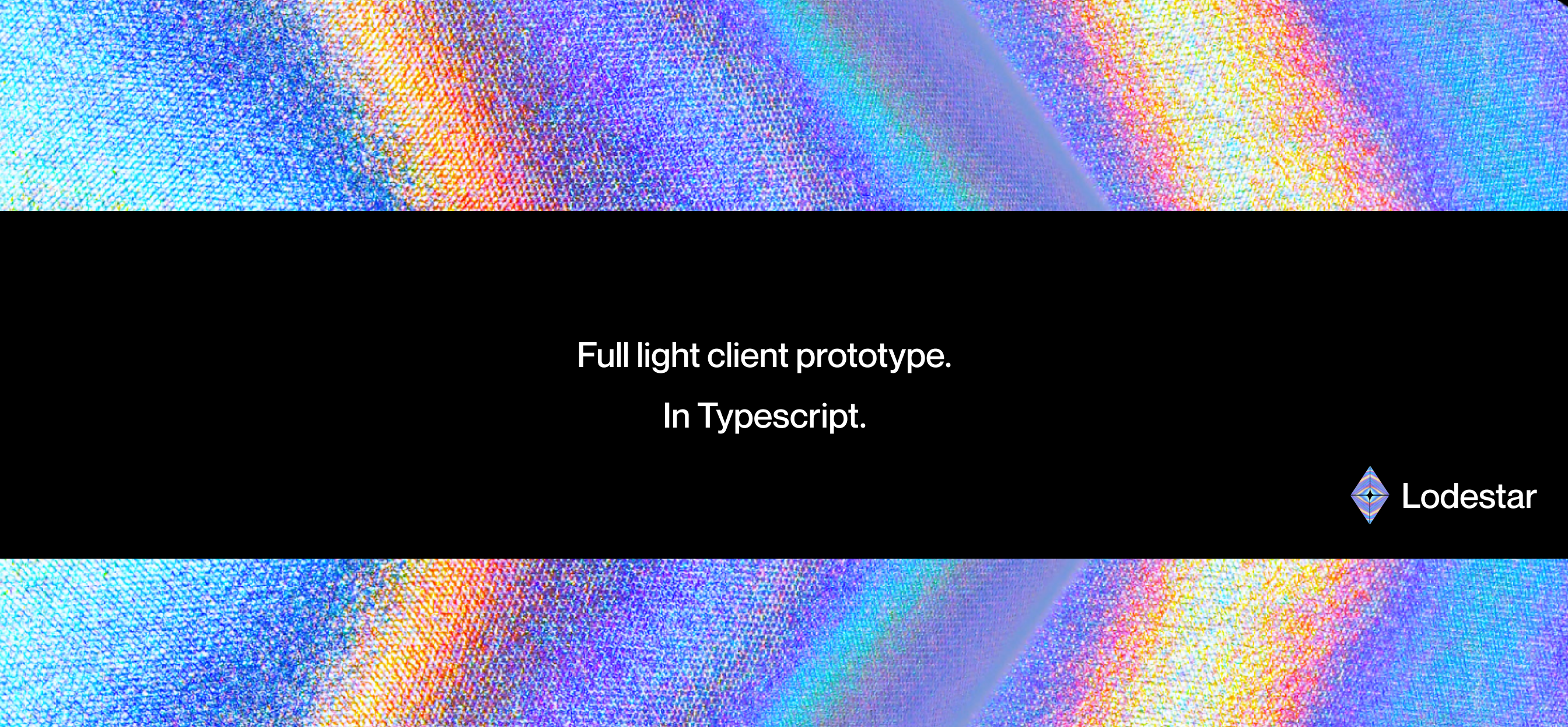
Since Lodestar is the Eth2 implementation written in Typescript, we at ChainSafe foresee that this may likely be the most accessible touchpoint to onboard new and curious developers.
In order to make strides on our mission of accelerating Web 3.0 adoption, sharing knowledge and bringing more people into the space is of utmost importance. We figured that repositioning the brand of Lodestar to reflect the spirit of the community and articulate the new role Lodestar plays is key to sustainable growth.
So we approached our in-house design department (population: 1) for the task.
The "why"
We wanted to develop a new visual language around our client in order to evolve how people use and experience Lodestar.
It's clear the most direct way for people to experience Lodestar is by using it to operate their Eth2 node, contribute to the code, or even build on it.
We hoped that we could illuminate other facets of Lodestar that may not be as well-known. For example, thanks to its modularity the team was able to split off utility functions and launch them as tools for anyone to use.

As open-source infrastructure situated within an incredibly vibrant community of developers, sharing what we've learned along the journey is a simple way to support and provide value for the Ethereum community. In Part 2 of the rebranding, we'll be unveiling the new website that consolidates tools and documentation pertaining to Eth2 and Typescript.
The "how"
There are a few properties that made branding Lodestar a special challenge:
-
It's a project within the house of ChainSafe;
-
It's essentially a public good, meaning the advertising reach won't be as forceful as that of a corporate entity;
-
There will always be many implementations of Ethereum. As such, differentiation is of notable importance.
As a result, the new identity would be a balancing act across numerous axes.
The new visual language was intended to
-
Establish a connection to Ethereum, yet be original enough to be easily identified
-
Be steadfast enough to withstand rapid upheaval within the ecosystem, but flexible enough to adapt to use cases far flung into the future;
-
And introduce the new roles Lodestar will play in people's lives, while embodying the spirit of its existing contributors and users.
We decided to go with something more evocative and less pictorial; after all, there isn't a 1:1 mapping that could summarize the value that Lodestar brings.
On the one hand, Lodestar is infrastructure surrounded by a highly technical community. On the other hand, the light client should become a popular entrypoint to blockchain for non-technical users.
As such, the utility that Lodestar provides will expand from being a source of tools and crypto libraries, to encompass the role of a trusted companion for learning and using Eth2 for end-users. Lodestar's commitment to quality code and flattening the steep learning curve of Eth2 would deeply enable others to innovate on the future of global infrastructure. That's the vision we're trying to bring to life.
Since we intend that there will always be a healthy amount of node implementations for a given protocol, designing a brand that will sit among permanent choices means that it's got to stand out.
The form has a window, kite, or Ethereum silhouette to be easily memorable, while the fluorescent blue lines pay subtle homage to the original Ethereum mark.
Do you remember getting into blockchain and crypto? The feeling that struck when you learned that the technology isn't merely for you for your passive toiling; that it was designed openly for you to build on, help govern, and invent with? Which led you down a rabbit hole of experimentation and the overwhelming desire to learn more? At least, we do...
And we thought, why not try to say this visually, given that this project is dead set on growing the community and spreading accessibility far and wide?
So we needed something vibrant and intriguing to draw people in, to embolden them to dive in and start experimenting. The colors were chosen to infuse a feeling of warm invitation with futurism; inspired by the emotion one feels at how readable and impressive the source code is! 😎
The way we see it at ChainSafe, conscious design respects the current users and mobilizes the future. Designing in a space where governance, markets and infrastructure is distributed means that anyone experiencing a brand isn't supposed to just sit and listen; they're crucial interlocutors of the conversation.
Users, builders, and community members are the fabric of the brand as they interact and push design and engineering up and onward.
That's it for now, folks. We've got plenty more brand identity work coming out this year as our projects approach mainnet, so it'd be invaluable to hear what you have to say.
Are you interested in designing blockchain applications and/or creating brands that support a more decentralized society? The design team at ChainSafe is hiring! Please send along a portfolio to careers@chainsafe.io to apply.
Get Involved
Learn more about ChainSafe by visiting our website, through our Medium, via Twitter, or by visiting the ChainSafe GitHub. Feel free to also join in on the conversation on Chainsafe's Discord!